Redundant Encoding in Data Visualisations

Redundant Encoding is the practice of adding multiple visual elements to a visualisation, to enhance effectiveness and ease-of-understanding. It is also referred to as redundancy. According to displayr.com, it can ‘improve the chances of a reader interpreting a visualization quickly and correctly’.

Redundant encoding applies to many elements of a visualisation, including colours, shapes, labels, and sizes.

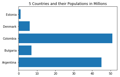
Here is a simple barplot with some countries and their populations. All the information needed to interpret the graph is included, but it is not necessarily easy to do so.

# create dataset
height = [45, 7, 51, 6, 1]
bars = ('Argentina', 'Bulgaria', 'Colombia', 'Denmark', 'Estonia')
y_pos = np.arange(len(bars))
 
# Create horizontal bars
plt.barh(y_pos, height)
 
# Create names on the x-axis
plt.yticks(y_pos, bars)

plt.title('5 Countries and their Populations in Millions')

# Show graphic
plt.show()
Firstly, we’ll add some axis labels and reorder the data based on the value of the bar, not its place in the dataset.

# Create a data frame
df = pd.DataFrame ({
        'Group':  ['Argentina', 'Bulgaria', 'Colombia', 'Denmark', 'Estonia'],
        'Value': [45, 7, 51, 6, 1]
})

# Sort the table
df = df.sort_values(by=['Value'])

y_pos = np.arange(len(bars))

# Create horizontal bars
plt.barh(y=df.Group, width=df.Value);
 
# Create names on the x-axis
plt.yticks(y_pos, bars)

plt.title('5 Countries and their Populations in Millions')
plt.xlabel('Population (Millions)')
plt.ylabel('Countries')

# Show graphic
plt.show()
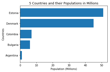
This simple change makes the graph easier to take in.

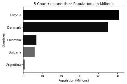
Another option is using colour to deliver a message. Here is an example of the same graph with colour being used to emphasize bar length. This might be an example of ‘less is more’. I am not sure in this case if the greyscale is adding to the graph or taking away from it.

# Create a data frame
df = pd.DataFrame ({
        'Group':  ['Argentina', 'Bulgaria', 'Colombia', 'Denmark', 'Estonia'],
        'Value': [45, 7, 51, 6, 1]
})

height = [45, 7, 51, 6, 1]

totalheight = sum(height)
# color = height/totalheight
color2 = [number / totalheight for number in height]
color2.sort(reverse=True)
color = [str(a) for a in color2]

# Sort the table
df = df.sort_values(by=['Value'])

y_pos = np.arange(len(bars))

# Create horizontal bars
plt.barh(y=df.Group, width=df.Value, color = color);
 
# Create names on the x-axis
plt.yticks(y_pos, bars)

plt.title('5 Countries and their Populations in Millions')
plt.xlabel('Population (Millions)')
plt.ylabel('Countries')


# Show graphic
plt.show()
Examples

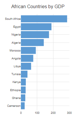
Here are some examples from other sources of great examples of redundant encoding. From displayr.com, showing use of colours and labels.
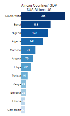
Before
And After!

From cnothelfer.com, showing redundant encoding in a scatterplot:
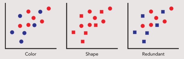
Great example.

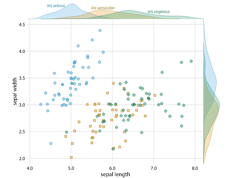
clauswilke.com is a wealth of great visualisations. Here’s a lovely example of redundanct encoding – a few seconds of examination provides effortless transfer of information.
Radar Graphs in Python using pyplot

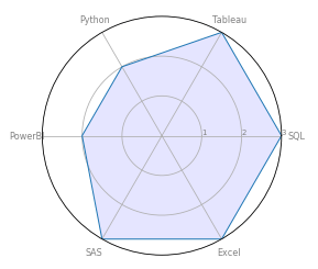
Radar/Spider graphs are a great way to display categorical data and compare categories between groups. They are easily interpretable and dynamic. This post summarises their use in Python and gives a few recommendations about their use.

In this example I am using them to create visualisations of skills for a CV.

First, import pandas and make a dataframe with the Software being displayed and the scores for each one. These graphs work particularly well when the numeric values are on a comparable scale.

# Import pandas library
import pandas as pd

# initialize list of lists
data = [['Software',3,3,2,2,3,3]]
 
# Create the pandas DataFrame
df = pd.DataFrame(data, columns = ['Metric', 'SQL','Tableau','Python','PowerBI','SAS','Excel'])

# print dataframe.
df
Dataframe output with my sample data.

Import the necessary libraries

# import Libraries
import matplotlib.pyplot as plt
from math import pi

Prep the data before graph creation. This involves counting the number of categories (6 in this example) and duplicating the first value at the end of the row to allow for the graph to display properly.

# Count the number of variables to be displayed
categories=list(df)[1:]
N = len(categories)

#define the values to be plotted by dropping the row name and retaining the numerical variables
values=df.loc[0].drop('Metric').values.flatten().tolist()
#then repeat the first value at the end of the list. This 'closes' the graph, making a complete shape
values += values[:1]
values

Time to create a radar graph! Initalise it, then add the axes, labels, data and fill the area. There is plenty of room for customisation here, including colours, font sizes and line widths.

# Initialise the radar graph
ax = plt.subplot(111, polar=True)

# Plot an axe for each of the categories
plt.xticks(angles[:-1], categories, color='grey', size=8)

# Add ylabels
ax.set_rlabel_position(0)
plt.yticks([1,2,3], ["1","2","3"], color="grey", size=7)
plt.ylim(0,3)
 
# Add data
ax.plot(angles, values, linewidth=1, linestyle='solid')
 
# Fill area
ax.fill(angles, values, 'b', alpha=0.1)

# Show the graph
plt.show()
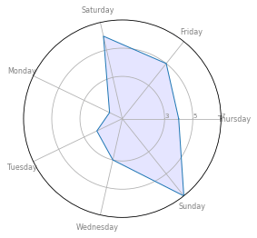
And we have a radar graph!

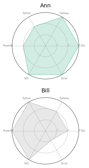
It is fairly easy to combine the code above in to a function that will create multiple graphs from a single dataframe. Here’s a function:

def radar_graph(row, title, color):

    # Count the number of variables to be displayed
    categories=list(df)[1:]
    N = len(categories)

    #define the values to be plotted by dropping the row name and retaining the numerical variables
    values=df.loc[row].drop('Category').values.flatten().tolist()
    #then repeat the first value at the end of the list. This 'closes' the graph, making a complete shape
    values += values[:1]
    values

    #Define the angle of each line in the plot, dependent on the number of categories
    angles = [n / float(N) * 2 * pi for n in range(N)]
    angles += angles[:1]

    # Initialise the radar graph
    ax = plt.subplot(111, polar=True)

    # Plot an axe for each of the categories
    plt.xticks(angles[:-1], categories, color='grey', size=8)

    # Add ylabels
    ax.set_rlabel_position(0)
    plt.yticks([1,2,3], ["1","2","3"], color="grey", size=7)
    plt.ylim(0,3)

    # Add data
    ax.plot(angles, values, linewidth=1, linestyle='solid', color=color)

    # Fill area
    ax.fill(angles, values, 'b', alpha=0.3, color=color)
    
    # Add a title
    plt.title(title, size=18, color="black", y=1.05)

    # Show the graph
    plt.show()

And here’s a dataframe that is updated to include two people’s skills.
The code calls the function and outputs a radar graph for each row in the dataframe. It also assigns a different colour to each graph.

# update dataframe to include two people and their skill scores
data = [['Ann',3,3,2,2,3,3],['Bill',2,2,3,3,3,1]]
df = pd.DataFrame(data, columns = ['Category', 'SQL','Tableau','Python','PowerBI','SAS','Excel'])

# define a colour palette:
colors = plt.cm.get_cmap("Set2", len(df.index))

# Loop to plot
for row in range(0, len(df.index)):
    radar_graph( row=row, title=df['Category'][row], color=colors(row))
    

Cautions and Warnings

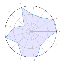
Radar graphs can get a bit of criticism.

Avoid using too many categories:

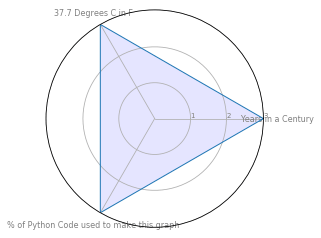
Or categories with different scales:

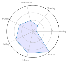
And be careful with the ordering of categories, since it has a big impact on the shape of the graph and can affect interpretability.

Python Graph Gallery has a good summary.
Here are some caveats, well illustrated.
Here is the matplotlib documentation.

Using Tableau to create flexible scheduled alerts

Tableau has useful functionality for setting data-driven alerts in its Dashboards. They can be set to check at time frequencies, from once-then-stop to as often as possible. They are a useful and dynamic way to provide information directly to dashboard consumers without relying on manual checks from the end-users.

The Requirement

Depending on whether you are using a live connection or a data extract, you get different behaviours from the alert functionality. The expectation of the consumers can be out of line with the behaviour of the alerts as well. For example, consumers might want to see the alert daily, at a specific time or set of times. They might need the alert to check and send early in the morning and late in the evening.
For this post let’s assume that is that ask – for a data-driven alert that can be tuned to some time in the morning and some time in the evening. Of course, this approach can be used for any chosen timeframes.

The Standard Solution

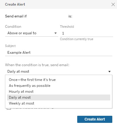
The normal approach to meet this need in Tableau is to set an hourly alert. The issue then is that you might overload the consumer with emails – and and hourly alert that is ignored is about as useful as not having an alert at all.
An alternative is to try and set a daily alert that triggers in the morning, and a separate daily alert that triggers in the evening. That won’t work long term because of how Tableau manages Daily Alerts internally – they are actually checked hourly and are prone to ‘drifting’, so the alert will send at different times throughout the day.

In both cases here, we end up with a solution that is inconsistent or overwhelming, and at the end of the day it is out of line with consumer needs and expectations.

An Alternative Approach

Here’s a trick that works to allow for very flexible, scheduled alerts for a Tableau Dashboard. I will describe the solution that works for the specific use case described above (a morning alert and an evening alert) but this can be generalised to ranges of specific hours, days, weeks, months etc.

Step 1: Use the NOW() function
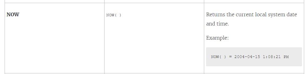
The NOW() function returns the current date and time as a datetime value.

Tableau’s NOW function explained. Note the reference to ‘current local system’ for later.

Step 2: Add a calculated field called ‘Hour of Day’, that extracts the hour from the NOW() function.

Extracting the hour from a datetime.
TRIM(LEFT(RIGHT(STR(DATETRUNC('hour',NOW())),8),2))

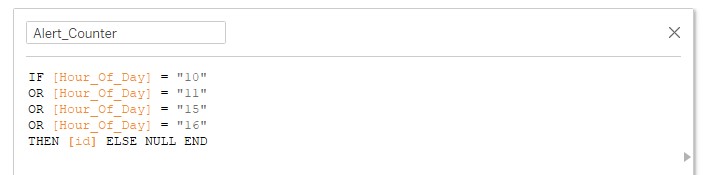
Step 3: Create a field based on whatever you’re measuring, that includes an IF statement. The IF statement should set the output to NULL outside the timeframe you’re interested in, and set the output to the measure of interest in the timeframe you’re interested in.
For this example want the alert to trigger from 10am-12pm and 3pm-5pm. The measure we’re interested in is called ID.

IF [Hour_Of_Day] = "10"
OR [Hour_Of_Day] = "11"
OR [Hour_Of_Day] = "15"
OR [Hour_Of_Day] = "16"
THEN [id] ELSE NULL END

Step 4: Add the counter to the visualisation, publish it, and set up an hourly alert on it.

How does it work?

The IF Statement forces the measure to be NULL for most of the time, and it only populates with a non-NULL value when (a) the time is within the specified range and (b) the thing being counted is present in the data. The hourly alert regularly checks the measure being counted, but the measure is forced to be NULL most of the time. In the specified time range (10am-12pm for our example, the measure can work correctly, and the alert can trigger).

Protips

Be conscious of the timezone of your server! The NOW() function shows the local datetime when you’re using Tableau Desktop, but it switches to the timezone of the server when you publish the Dashboard. It can be helpful to have a view on your Dashboard that displays the value of the NOW() function, to help make sense of this difference.

Be aware of how scheduled extracts line up with your alerts. There is no point in setting alerts at 1pm, 3pm and 5pm every day if your extract only refreshes once a week! Try experiment with setting multiple extracts on a single data source to get the right cadence of extracts for your alerts.