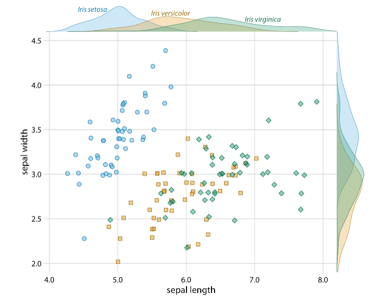
Redundant Encoding is the practice of adding multiple visual elements to a visualisation, to enhance effectiveness and ease-of-understanding. It is also referred to as redundancy. According to displayr.com, it can ‘improve the chances of a reader interpreting a visualization quickly and correctly’.
Redundant encoding applies to many elements of a visualisation, including colours, shapes, labels, and sizes.
Here is a simple barplot with some countries and their populations. All the information needed to interpret the graph is included, but it is not necessarily easy to do so.
# create dataset
height = [45, 7, 51, 6, 1]
bars = ('Argentina', 'Bulgaria', 'Colombia', 'Denmark', 'Estonia')
y_pos = np.arange(len(bars))

# Create horizontal bars
plt.barh(y_pos, height)

# Create names on the x-axis
plt.yticks(y_pos, bars)

plt.title('5 Countries and their Populations in Millions')

# Show graphic
plt.show()
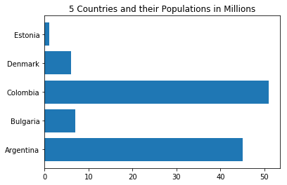
Firstly, we’ll add some axis labels and reorder the data based on the value of the bar, not its place in the dataset.
# Create a data frame
df = pd.DataFrame ({
        'Group':  ['Argentina', 'Bulgaria', 'Colombia', 'Denmark', 'Estonia'],
        'Value': [45, 7, 51, 6, 1]
})

# Sort the table
df = df.sort_values(by=['Value'])

y_pos = np.arange(len(bars))

# Create horizontal bars
plt.barh(y=df.Group, width=df.Value);

# Create names on the x-axis
plt.yticks(y_pos, bars)

plt.title('5 Countries and their Populations in Millions')
plt.xlabel('Population (Millions)')
plt.ylabel('Countries')

# Show graphic
plt.show()
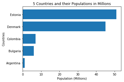
This simple change makes the graph easier to take in.
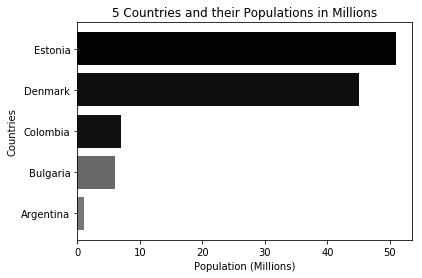
Another option is using colour to deliver a message. Here is an example of the same graph with colour being used to emphasize bar length. This might be an example of ‘less is more’. I am not sure in this case if the greyscale is adding to the graph or taking away from it.
# Create a data frame
df = pd.DataFrame ({
        'Group':  ['Argentina', 'Bulgaria', 'Colombia', 'Denmark', 'Estonia'],
        'Value': [45, 7, 51, 6, 1]
})

height = [45, 7, 51, 6, 1]

totalheight = sum(height)
# color = height/totalheight
color2 = [number / totalheight for number in height]
color2.sort(reverse=True)
color = [str(a) for a in color2]

# Sort the table
df = df.sort_values(by=['Value'])

y_pos = np.arange(len(bars))

# Create horizontal bars
plt.barh(y=df.Group, width=df.Value, color = color);

# Create names on the x-axis
plt.yticks(y_pos, bars)

plt.title('5 Countries and their Populations in Millions')
plt.xlabel('Population (Millions)')
plt.ylabel('Countries')


# Show graphic
plt.show()
Examples
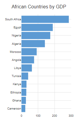
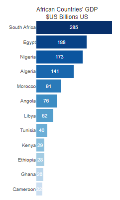
Here are some examples from other sources of great examples of redundant encoding. From displayr.com, showing use of colours and labels.
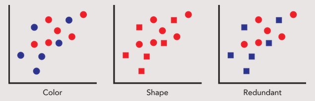
From cnothelfer.com, showing redundant encoding in a scatterplot:
clauswilke.com is a wealth of great visualisations. Here’s a lovely example of redundanct encoding – a few seconds of examination provides effortless transfer of information.