Radar/Spider graphs are a great way to display categorical data and compare categories between groups. They are easily interpretable and dynamic. This post summarises their use in Python and gives a few recommendations about their use.
In this example I am using them to create visualisations of skills for a CV.
First, import pandas and make a dataframe with the Software being displayed and the scores for each one. These graphs work particularly well when the numeric values are on a comparable scale.
# Import pandas library
import pandas as pd

# initialize list of lists
data = [['Software',3,3,2,2,3,3]]

# Create the pandas DataFrame
df = pd.DataFrame(data, columns = ['Metric', 'SQL','Tableau','Python','PowerBI','SAS','Excel'])

# print dataframe.
df

Import the necessary libraries
# import Libraries
import matplotlib.pyplot as plt
from math import pi
Prep the data before graph creation. This involves counting the number of categories (6 in this example) and duplicating the first value at the end of the row to allow for the graph to display properly.
# Count the number of variables to be displayed
categories=list(df)[1:]
N = len(categories)

#define the values to be plotted by dropping the row name and retaining the numerical variables
values=df.loc[0].drop('Metric').values.flatten().tolist()
#then repeat the first value at the end of the list. This 'closes' the graph, making a complete shape
values += values[:1]
values
Time to create a radar graph! Initalise it, then add the axes, labels, data and fill the area. There is plenty of room for customisation here, including colours, font sizes and line widths.
# Initialise the radar graph
ax = plt.subplot(111, polar=True)

# Plot an axe for each of the categories
plt.xticks(angles[:-1], categories, color='grey', size=8)

# Add ylabels
ax.set_rlabel_position(0)
plt.yticks([1,2,3], ["1","2","3"], color="grey", size=7)
plt.ylim(0,3)

# Add data
ax.plot(angles, values, linewidth=1, linestyle='solid')

# Fill area
ax.fill(angles, values, 'b', alpha=0.1)

# Show the graph
plt.show()
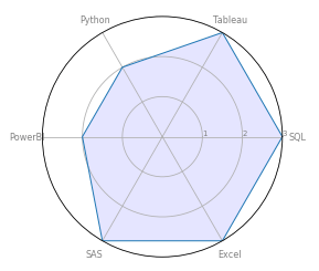
It is fairly easy to combine the code above in to a function that will create multiple graphs from a single dataframe. Here’s a function:
def radar_graph(row, title, color):

    # Count the number of variables to be displayed
    categories=list(df)[1:]
    N = len(categories)

    #define the values to be plotted by dropping the row name and retaining the numerical variables
    values=df.loc[row].drop('Category').values.flatten().tolist()
    #then repeat the first value at the end of the list. This 'closes' the graph, making a complete shape
    values += values[:1]
    values

    #Define the angle of each line in the plot, dependent on the number of categories
    angles = [n / float(N) * 2 * pi for n in range(N)]
    angles += angles[:1]

    # Initialise the radar graph
    ax = plt.subplot(111, polar=True)

    # Plot an axe for each of the categories
    plt.xticks(angles[:-1], categories, color='grey', size=8)

    # Add ylabels
    ax.set_rlabel_position(0)
    plt.yticks([1,2,3], ["1","2","3"], color="grey", size=7)
    plt.ylim(0,3)

    # Add data
    ax.plot(angles, values, linewidth=1, linestyle='solid', color=color)

    # Fill area
    ax.fill(angles, values, 'b', alpha=0.3, color=color)

    # Add a title
    plt.title(title, size=18, color="black", y=1.05)

    # Show the graph
    plt.show()
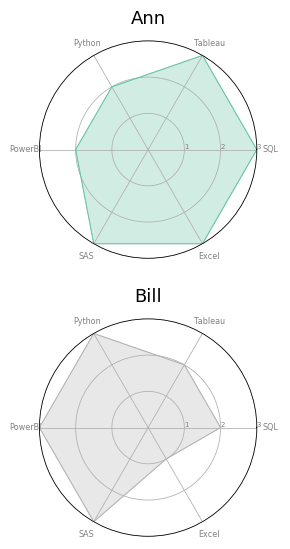
And here’s a dataframe that is updated to include two people’s skills.
The code calls the function and outputs a radar graph for each row in the dataframe. It also assigns a different colour to each graph.
# update dataframe to include two people and their skill scores
data = [['Ann',3,3,2,2,3,3],['Bill',2,2,3,3,3,1]]
df = pd.DataFrame(data, columns = ['Category', 'SQL','Tableau','Python','PowerBI','SAS','Excel'])

# define a colour palette:
colors = plt.cm.get_cmap("Set2", len(df.index))

# Loop to plot
for row in range(0, len(df.index)):
    radar_graph( row=row, title=df['Category'][row], color=colors(row))
Cautions and Warnings
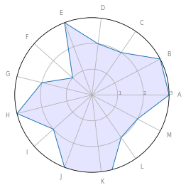
Radar graphs can get a bit of criticism.
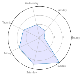
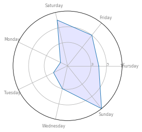
Avoid using too many categories:
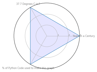
Or categories with different scales:
And be careful with the ordering of categories, since it has a big impact on the shape of the graph and can affect interpretability.
More resources and links
Python Graph Gallery has a good summary.
Here are some caveats, well illustrated.
Here is the matplotlib documentation.

